Table of contents:
TL;DR
- Lower thirds are informative text-based overlays that show up at the bottom of videos.
- You’ll find lower thirds in social media posts, news stories, or interview-type videos.
- When creating lower thirds keep on brand and pay attention to design elements like color, typography, and duration.
- You can add lower thirds in a live recording or use an editor to add them to videos after recording.
Ever wondered what those informative text overlays at the bottom of videos are called? They’re called lower thirds, and they can add a professional touch to your content.
Lower thirds can enhance viewer engagement and boost your brand’s credibility. They’re a must-have tool for video creators.
For many new creators, the concept of lower thirds can feel daunting or unclear. That's why we’re here to help.
In this guide, we’ll explain exactly what design elements to focus on, how to add Lower Thirds to videos and we share bonus Lower Third templates!
Let’s dive in!
Table of contents
- What are lower thirds?
- What are lower thirds used for?
- Why should you use lower thirds?
- Lower third elements to keep in mind
- How to add lower thirds to videos with Riverside
- 3 Best lower third templates to get you started
- Best practices for using lower third graphics in videos
- FAQs on lower thirds
- Final thoughts
What are lower thirds?
Have you ever watched an online video or even a TV show and noticed a combination of logo and text elements at the bottom of the screen? Those are lower thirds!
A lower third is a combined text and graphic design element in an onscreen display's lower section or third. These elements provide audiences with extra information, all without distracting from the main content materials.
What are lower thirds used for?
There are many instances where lower thirds can be helpful in enhancing production quality and clarifying important details for your viewers.
Social media posts
Often, lower thirds design is used for social media videos! This may apply to video content or to a still image.
In the lower section of the display, graphic design elements may provide important information. This could include a product’s name and price, or the design may highlight a brand logo or special sales offer.
Example:
.webp)
News stories
One of the most common uses of lower thirds is for news communications.
A story’s headline might appear at the bottom of the screen alongside other key details. This could include the network’s logo and whether or not the story is breaking or a live broadcast.
These materials add context and enhance the meaning of the presented video package.
Example:

Interviews and documentaries
Lower thirds are frequently used for video interviews and documentary productions. You might even notice these elements in some reality TV programmes.
In this context, designs might include a speaker’s name or job title to substantiate their identity and provide context for the audience.
Example:

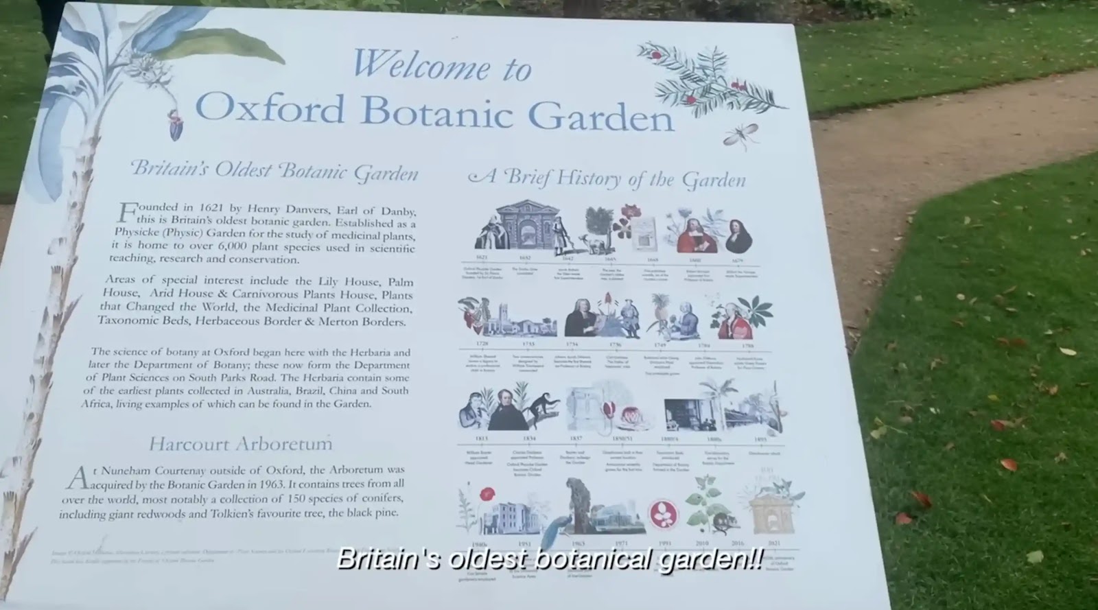
Vlogs and behind-the-scenes clips
Similarly, lower thirds elements often appear on vlogs and other behind-the-scenes video clips. This can be helpful when audiences need additional information to help them understand what’s going on. Here, designs might include a brand logo and a speaker’s name, or even a filming location.
Example:
Educational productions
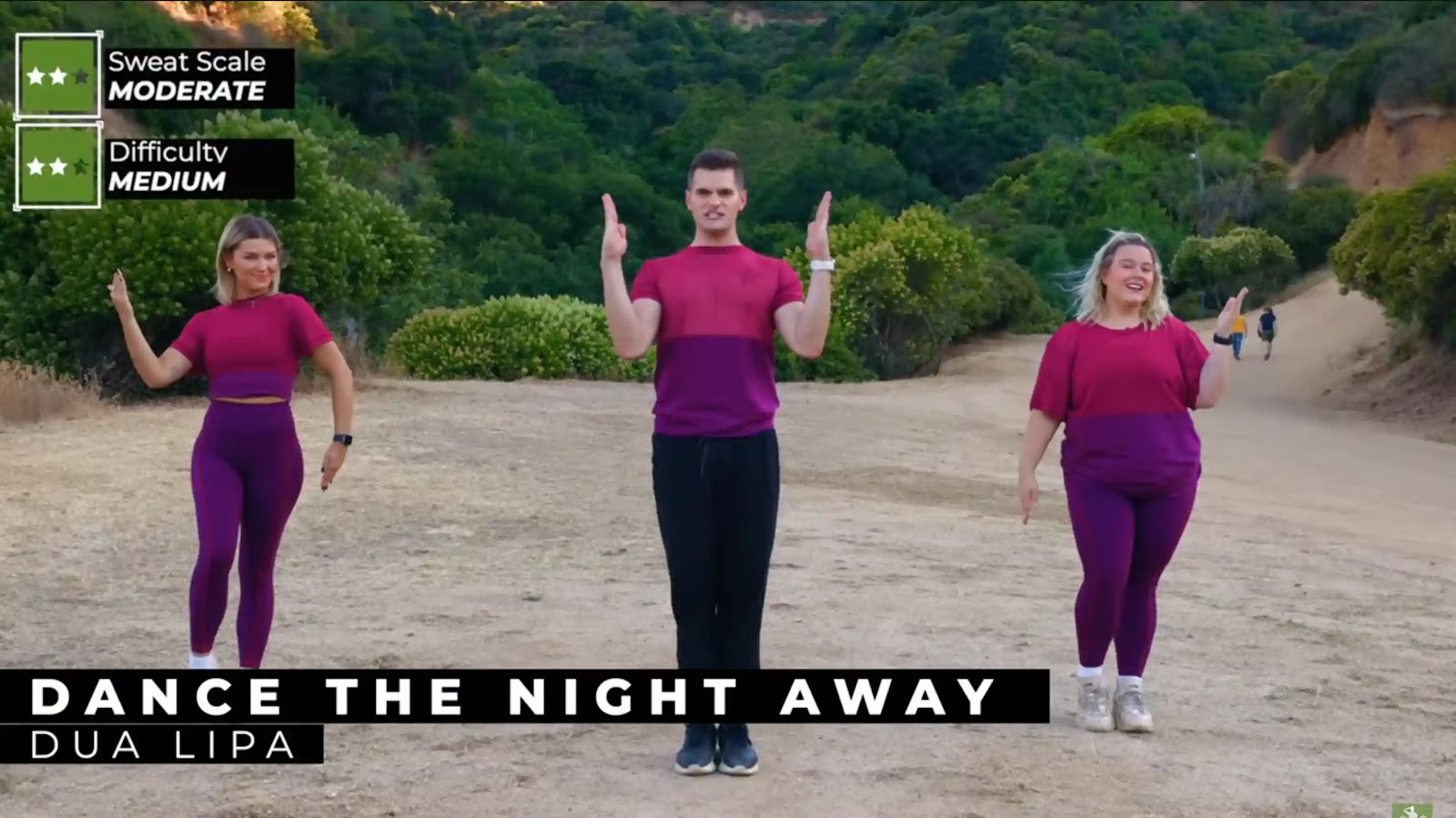
For educational materials and video learning, lower thirds can be a valuable tool. They help audiences keep up with even complex information.
At the bottom of the screen, graphic design elements may feature relevant statistics or the definition of a new term or phrase. These clarifications can support understanding and add context not otherwise covered in video or audio content.
Example:
Why should you use lower thirds?
Lower thirds offer many great advantages, regardless of what kind of content you’re working on!
Professionalism: Lower thirds enhance your credibility by making your content appear more curated and professional. Firstly, this is a way you can highlight your brand. But , you can also add information such as speaker titles to increase credibility.
Engagement: Even simple lower thirds inclusions have been found to improve audience engagement and drive interactions. Research shows that adding text elements can help reduce your audience’s cognitive load when watching a video.
Information: Lower thirds can clarify content and help deliver valuable secondary information.
Lower third elements to keep in mind
When considering lower thirds design, there are a few key elements you should keep in mind.
Color
First, think about the colors you’re using and what they communicate to your audience.
Ideally, your design should rely on your brand colors as much as possible.
It’s important to ensure that your color choices are clear and easy to read against your video background without distracting too much from the main content.
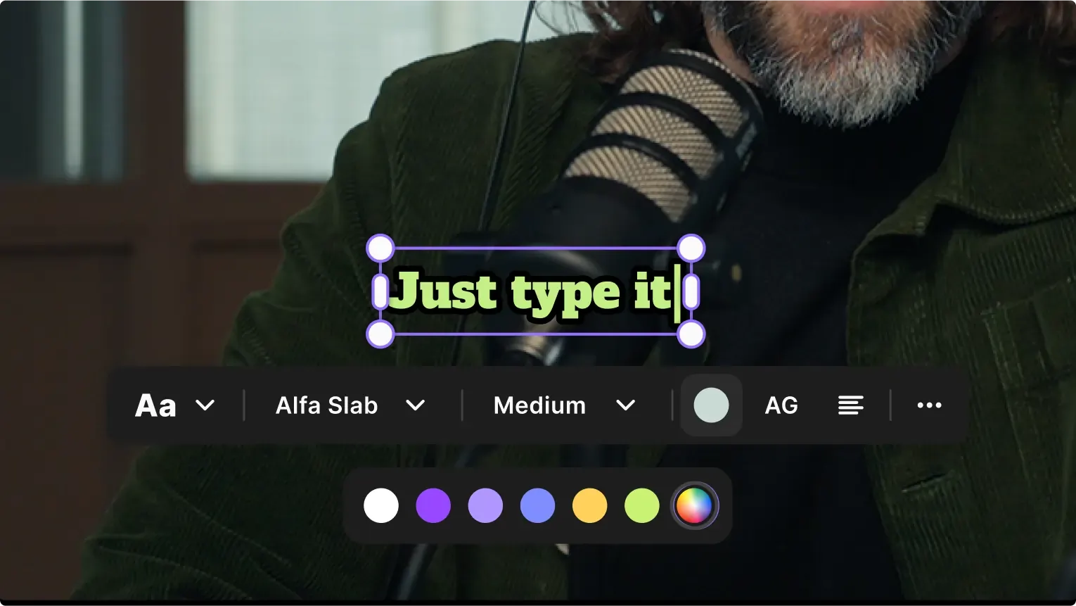
Typography
Likewise, you need to be strategic about your typography.
Whenever possible, try to use recognizable fonts that align with your brand’s identity.
Always ensure that you are consistent with your typography selection, and avoid frilly or hard-to-read lettering.
Clear sans-serif fonts are the best option for readability. These fonts are more modern. If you want to portray yourself in a more formal manner, then serif fonts may be an option for you.
Logos
Often, lower thirds designs can include your logo, which is an excellent opportunity to tie in your identity and build brand awareness.
If you’re including your logo in a lower thirds graphic, make sure it blends seamlessly with other materials. Your logo should be clear and well-integrated without creating a distraction.
Size and position
The size and position of your lower thirds design can make an impact, so you need to choose wisely.
Aim to place lower thirds in the bottom third of your screen and ensure they don’t obscure important video elements.
Your design should be large enough so that it’s easy to read. But, it should avoid taking up too much on-screen real estate.
Duration
The best duration for a lower thirds design will depend on your unique content.
However, generally speaking, graphic elements should linger for three to six seconds. This way, you can allow viewers enough time to take in information and get extra content off the screen before it gets in the way.
Animations and transitions
Just as important as your lower thirds design is the transitions approach you choose.
Do design elements appear on-screen, then disappear abruptly?
Or do they more gently drift into focus and away again?
Smooth transitions can help you avoid distracting your audience or detracting from the main content of your video.
How to add lower thirds to videos with Riverside
Riverside is a studio-quality recording, editing, and live streaming software. You’ll find everything you need for high-quality video creation. This includes lower-thirds which you can easily add in the video editor.
Adding lower thirds via text overlays after recording
You can follow this video on our text overlays, or read the steps below:
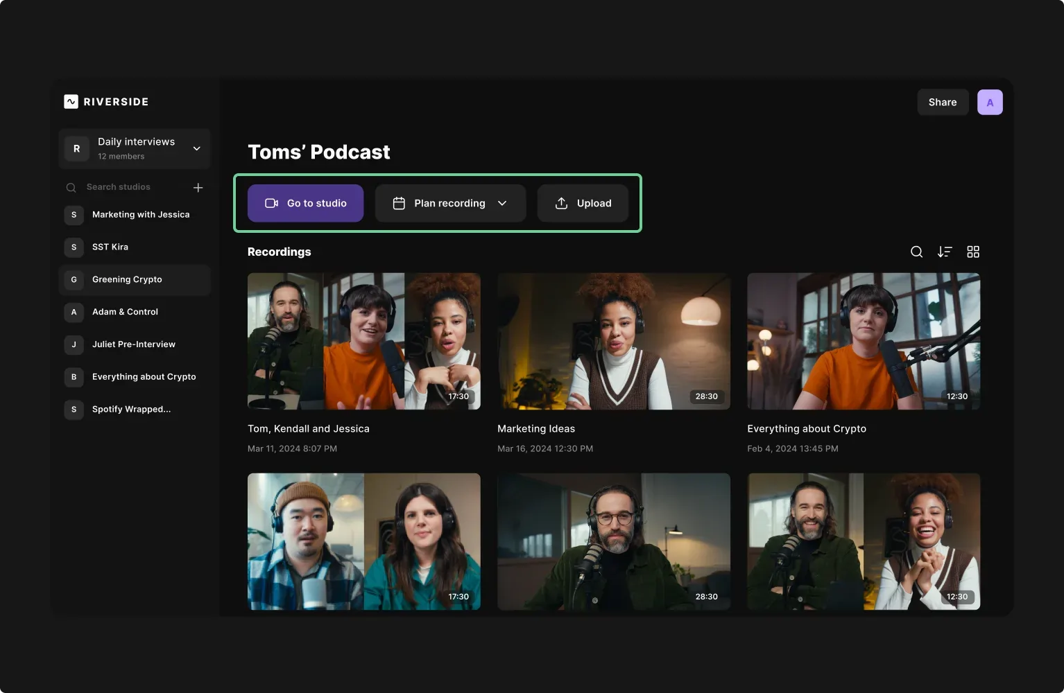
Step 1: Log into Riverside and choose an existing studio from the left toolbar. If you haven’t created one already you can select the “+” button at the top to create one.
In your studio dashboard, you can select “Go to studio” to record your own video directly on Riverside. (Learn how here).
Alternatively, you can upload your own video by selecting “Upload”.
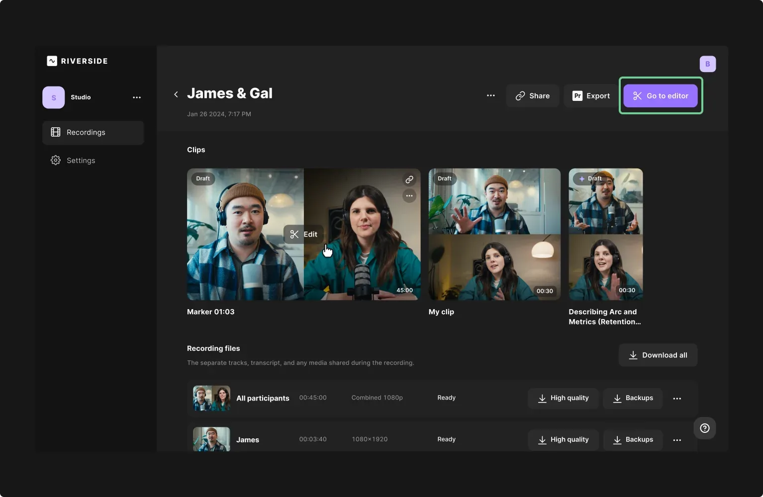
Step 2: Once your recording or uploading, select your chosen project in the studio dashboard. Press the “Go to Editor” button to launch the Riverside Editor.
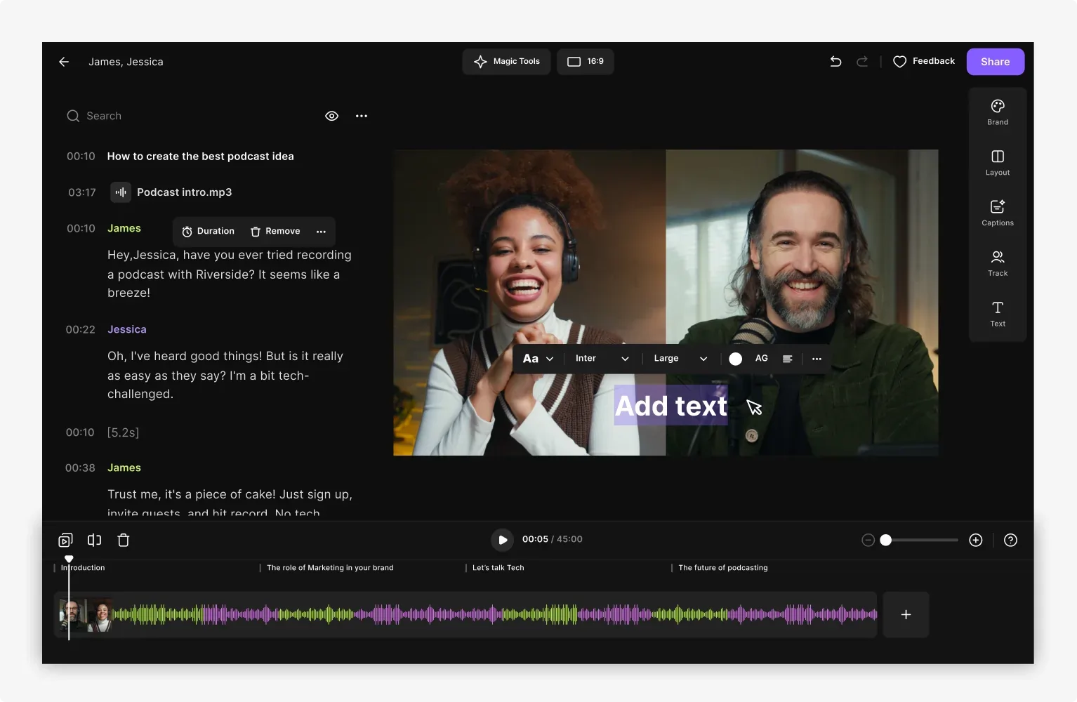
Step 3: In the Editor, select “Text” from the menu bar on the right of your screen.
Step 4: Use the tools to apply text overlays, including resizing and customizing colors, fonts, placement, and other design elements.
Step 5: When you’re happy with your final design, navigate to the “Export” menu to save and download your completed video project.
Adding lower thirds to your live recording
If you’d like to add lower thirds to a live recording, you can do so with the help of third-party software.
You can watch the video below to learn how:
3 Best lower third templates to get you started
Searching for simple yet effective lower thirds templates to help you kickstart your content strategy? Try these designs!
Corporate lower thirds
Looking for a simple, streamlined, easily customizable lower thirds option? This Adobe Stock template offers seven unique styles with basic animations and your choice of placement and color scheme.
.webp)
Best for: Professional videos in need of a sleek, easily legible design.
Minimal lower thirds
Make your video the star of the show with simple, cleanly designed lower thirds that won’t distract from the big picture. This Motion Array template provides fully customizable simplistic design options that allow you to add as much or as little text as needed.
.webp)
Best for: Creators who want easy-to-read lower thirds that keep the focus on the video.
Creative lower thirds
Craft bold and engaging video content with these unique, creative lower thirds options! This Envato Elements template package provides you with a selection of visually appealing designs, adaptable to suit any video type, style, or topic.

Best for: Creative video producers looking for a fresh lower thirds approach.
Best practices for using lower third graphics in videos
If you’re keen to start incorporating lower third graphics in your videos, these best practices can help you stay on track. Remember…
Prioritize good design
Good design is critical when it comes to producing high-value video content, and lower thirds elements are no exception.
When adding lower thirds to your clips, be thoughtful in your color, placement, and typographic choices. Aim for sleek, professional design that shows off the best of your brand.
Know when to use lower thirds
Lower thirds are most effective when they’re used in the right contexts.
Add these designs when you introduce a new speaker or location or when you need to offer supporting context for a new idea.
Use lower thirds as visual cues to reinforce video and audio materials, or add them to clarify your brand when relevant.
Check your content
Last but not least, check your content, and check it again.
Take the time to comb over your designs so that you don’t miss any typos or mistakes. This can help you ensure that only your best work is published, ultimately showcasing the best of your brand and your video creation skills.
FAQs on lower thirds
Still unsure about lower thirds? Here are our answers to a few frequently asked questions!
What is the difference between a chyron and a lower third?
A chyron is a lower third! Chryron was the name of a brand that once led the market for text-based graphic elements. The brand was so dominant that lower thirds designs took on the company name. Today, these terms are often used interchangeably.
What is another name for the lower thirds?
Lower thirds are sometimes referred to as “chyrons,” “banners,” “supers,” or even simply “L3s.”
All of these terms refer to the same design styles applied to add supplementary information, usually within the lower third of your screen display.
When is a good time to use lower thirds?
There are many instances when lower thirds can be helpful, especially where you think audiences could benefit from additional information.
Lower thirds can be used to:
- Present a headline or a speaker name
- Communicate a filming date or location
- Identify your brand on the screen
- Define key terms relevant to your video
- Support a conversation with statistics and other information.
How do you use lower-third templates?
Every lower-third template is unique! Most templates will allow you to download pre-made designs and apply these to an existing video project.
Every platform is unique, but in your editor these are usually available under overlay or text settings.
Often, you can customize a wide range of components, from the font and color to text, placement, and the presence or absence of a brand logo.
Final thoughts
When it comes to achieving success as a video creator, professionalism is key, and lower thirds can help! If you want to explore your options for integrating effective, impactful lower-thirds designs, you can get started right away. Log onto Riverside, and produce clear, comprehensive video designs with ease.


.webp)

-(1)-(1).webp)
.webp)

.webp)
.webp)


